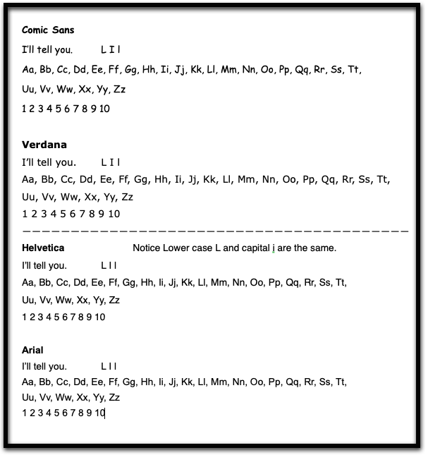
Accessible fonts are typefaces that have been shown to improve readability of print text. Most are sans serif fonts, which are minimal and feature simple clean lines. They also feature sufficient space between the individual letters.
How do I use it?
When writing a text, select one of the following common sans-serif fonts: Comic Sans, Verdana, Tahoma, OpenDyslexic, Calibri. (Note: this is not an exhaustive list)
Alternatively, select the text in a document that does not use an accessible font and change it to one that is.
How does it help?
Accessible fonts with clean lines facilitate letter/word recognition and readability. Whatever the situation, it is recommended that the user try out a few fonts and choose the one that makes the reading task easier.