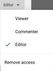
When sharing documents in a G-Drive make sure the permissions are set to allow the user to be an “Editor”. If not they will not be able to work in the document at all, or only leave comments.
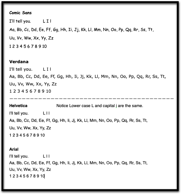
Sample of some fonts that meet the standard and some that don’t.
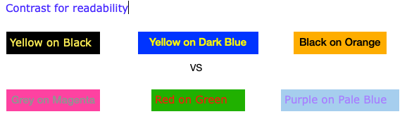
When using colour to convey information or meaning, indicating an action, prompting a response, or distinguishing a visual element, it is important to also provide other means of conveying this information. Some users may not be able to determine or perceive the the different colours.
It is equally important to pay attention to colour contrast for on screen use, and what a text looks like when printed. This includes the colour of the paper that is printed on.
Text is much easier to read when the line spacing is at least 1.5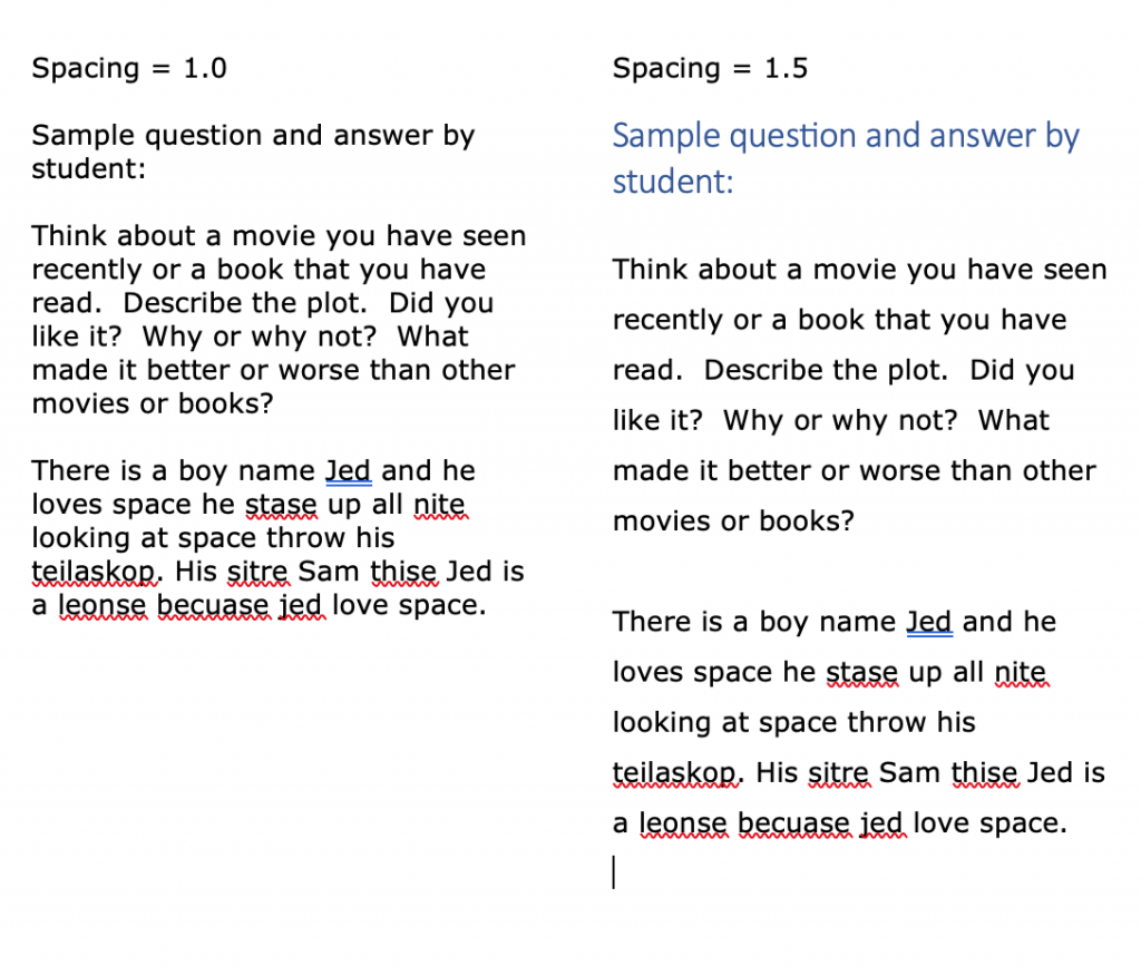
Line spacing in WORD
Line spacing in Google Docs
Left alignment is the best for readability because of the way our eyes track when reading.
Although most Text to Speech features do a great job of reading a text out loud, using symbols or emojis within a text may not work as intended. It is best to try out the text with TTS before it is “published”.
Some emojis may have an embedded alternate text that gets read, other symbols will just be skipped over.
Symbols with TTS WordQ
Symbols with Read&Write in Google Docs
Pagination (numbering the pages in a document) helps make larger amounts of content, more manageable. When combined with an index or table of contents, specific information within a document is easier to locate or scroll back to.
Both WORD and GOOGLE Docs have the ability to add page numbers for pagination.
Headings need to be:
They can be used by screen readers to create a list of headings in a document that can then be skimmed through quickly to find related content.
Proper use of Headings also helps when creating a Table of Contents for longer documents.
Item 10 in this list provides for Page numbers, Item 11, for Headings. Once these are in a document they can be used to create a hyperlinked table of contents for a document. This provides quick and direct access to information within your document without having to scroll through pages to find it.
When creating digital documents where students are required to both read content and then provide written answers, it is important that both the text to be read by them and the text that they write is compatible with Text-to-Speech software and spelling and grammar checkers. Item 1 and Item 3 in this list will help here. This is particularly important when creating PDF’s. They must be accessible.
An image as a background can be distracting to the reader. Also, in most cases, if not formatted properly, the text in the image is not accessible to Text-to-Speech software. Having the text above or below avoids these issues.
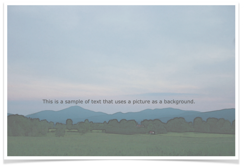
This is an image background with a text on top.
(Try to select the text for TTS)

